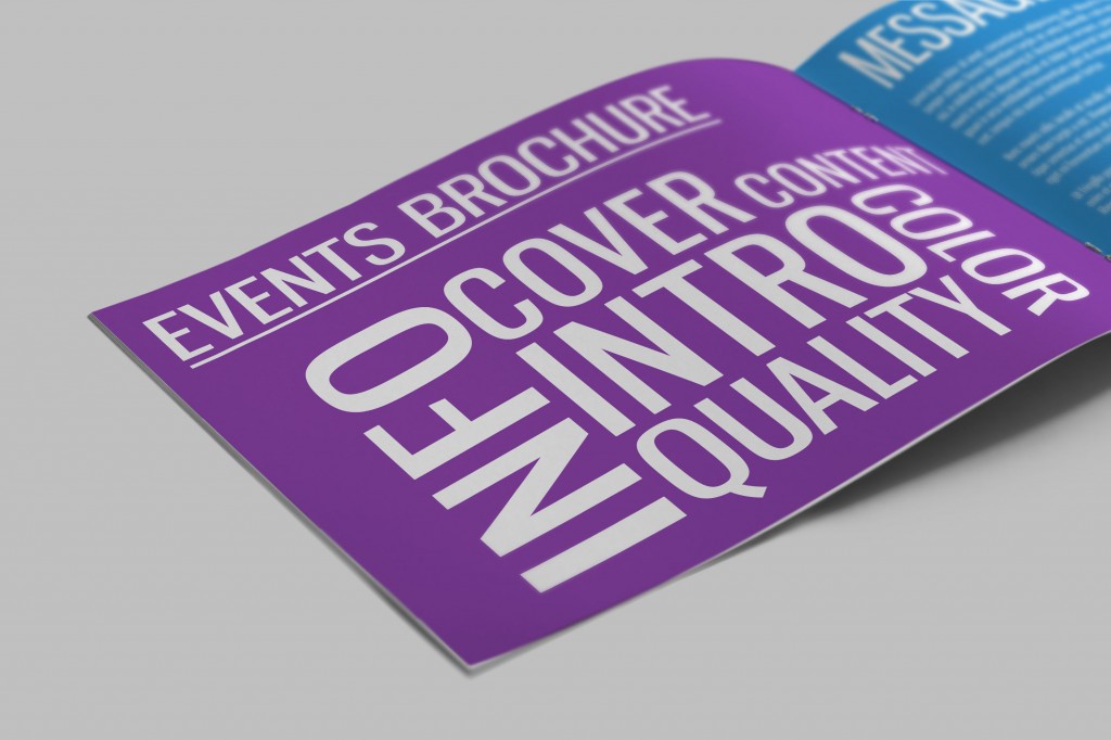
The design of your Events Brochure should combine equal elements of eye catching design and media content, as well as all the information you wish to convey to the reader. This isn’t always as easy as it sounds, especially if you have to stay within the constraints of a certain theme.
Here are 5 tips to help you create the perfect brochure for your event!
1. Cover
Your brochure’s cover should be bold, and eye-catching. Use block fonts where possible and try to sum up what the event is all about in a few lines. Show the dates clearly, and try not to pack in too much information and graphics as this will detract from your main message. Include information that will instantly grab attention, try not to talk about yourself or sponsors in too much detail, focus on activities, freebies, dates and guests.
Solopress Brochures 170gsm Silk
2. Colour
Colours should be contrasting to any text and imagery, yet not out of place. If including spreadsheets and graphs, ensure their colours don’t clash or get confused with the background colours of the pages. If you’re promoting a seasonal event be sure to stick to a theme thats in keeping with that particular season, such as bright florals and sky blues in Summer, and colder shades of blue with whites and greys for winter.
3. Information
A list of events and dates for festivals spanning multiple days, laid out in a calendar or TV guide style for reference, as well as dedicated pages to a particular stage, group, tent or day. Somewhere in your brochure should be clear directions and maps for those travelling to your event – this is a good place to include details of special access and entry for those with impairments or disabilities.
It should be a no brainer to include contact information for press releases and questions and more importantly a link to your website or a QR code for your app. Be aware of space when laying out the page, subtitles, lists and info boxes can help organise your text. Splitting your paragraphs into bitesize chunks, rather than a wall of text can help readers digest what you’re trying to get across.
4. Content
As well as all the useful information, the arrangement of content is hugely important. Title your pages boldly, this allows skim readers to stop at a page that catches their eye as well as giving your layout proper structure. If your brochure is several pages long, a contents index is helpful for your readers to get to the page they need, quickly. Where possible use genuine images rather than stock photography and graphics, and if you know a skilled designer, perhaps assign them the task of making appropriate graphics to illustrate the text. Mascots and icons can bring to life a page and fill space.
Flyer & Leaflet inserts with sign-up forms, voucher codes, maps, programmes and menus can be included in the pages to be taken out and used at the event, as if the brochure is large it could be quite cumbersome to lug around.
5. Quality
The quality of your brochure reflects on your organisation. Scruffy, squashed up, badly laid out and designed brochures will ultimately give a worse impression than you would like to give.
The printing quality of your brochure should be as good as you can afford to get it, with full colours, good quality paper and strong binding. Great quality printing needn’t always cost an arm and a leg – check out Solopress’ great value brochure printing. A testament to the Solopress’ ethos, the lithography printers are absolute perfectionists and will work flat out to ensure your brochures are as great as they can be.


Thanks, good bit of info!
Interesting article, certainly something to take on board when considering a brochure for an event.
How to get this message out to the public, who are mostly now designing tickets, flyers and posters themselves?
The vast majority of these are difficult to read, badly worded and do not give the salient information.
Back in the 1960s, (eeeh, lad!) both boys and girls were given the opportunity to learn typing, which included page layout. Perhaps we need to get some of these basic lessons back into schools.
Instead of trying to teach kids to develop software, we should be teaching the basic building blocks.
(Rant over!)
Thanks for your comments James. Unfortunately the focus on Software Development and IT is not nearly as major as it should be! It’s still very basic unless you go on to take it at college or uni. I agree typing should be a focus for schools perhaps instead of some other subjects, but could be taught under the umbrella of IT and development as it’s an important part of designing anything on a computer, including web and UI design!
Really useful, so easy to overlook important factors – and very easy to mess it up! Thanks 🙂
thank you for sharing you 5 top tips, going to help me a lot
Comments are closed.