When you think of a city, what do you think of? Perhaps it’s the landmarks, the culture, the cuisine or the weather. If you’re anything like us though, these things come second to the real attraction: the typography. A great font can truly form the identity of a city. It can give it character, convey its personality and get people really, really excited (but that could just be us).
Step into the world of city fonts and enjoy our top eight picks…
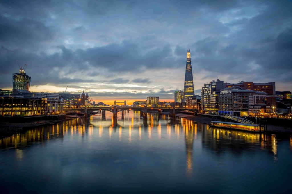
London
It’s been one whole century since the iconic font of the capital was introduced.[1] Johnston, designed by Edward Johnston, made its mark on the London Underground in 1916. Very few alterations have happened since, so it’s a font that really has stood the test of time.
It was groundbreaking when it was unveiled too – curly art nouveau typefaces were de rigueur back then, so this minimal and bold offering was a shock to the system for Johnston’s contemporaries. Today, the font appears all over the tube stations, trains, buses, and signage across the city.
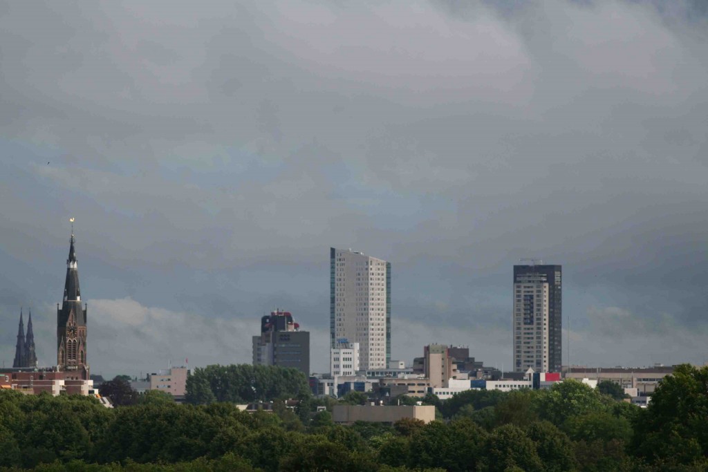
Eindhoven
The story behind the Netherlands’ Eindhoven font is a fascinating one. The logo – a trio of red zig-zags – actually came first, then the city wanted a typeface to match[2]. The eponymous font’s original sketches were created with sticky tape, hence the missing corners on the letters you see today. It’s this mix of simple and quirky that we just can’t get enough of – we might even take our next holiday to the Netherlands, solely based on its font.
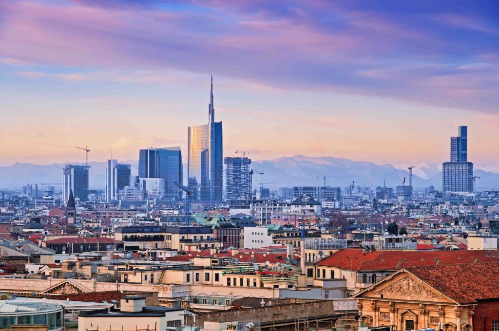
Milan
The font of Milano City manages to radiate a sense of history, while sitting on the right side of sleek and geometric. It’s not as bold and modern as other city fonts, which totally works for the city’s vibe. Created by Inarea Strategic Design, the font often looks like it’s missing minute parts, from the tittles above i’s and j’s to the diagonal finishes on n’s and l’s. It’s these weird flourishes that get us all kinds of excited.
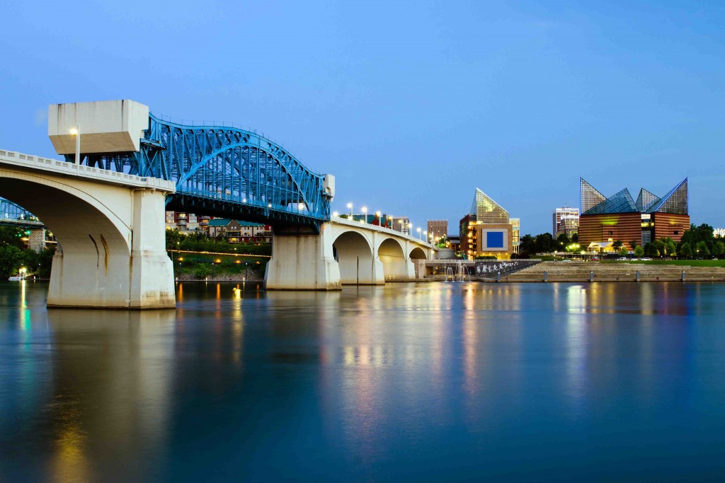
Chattanooga
Is there anything not to like about the Chattanooga font? Its origin[3] is thanks to a band of designers who raised more than $11,000 on Kickstarter to make the fun typeface. The city had fallen on hard times and these designers wanted to help out. The result? Chatype, a font that evokes the spirit of the city, yet still has a cool vibe we’re completely down with. Say hello to a whole new look for Tennessee’s fourth-largest city.
Dubai
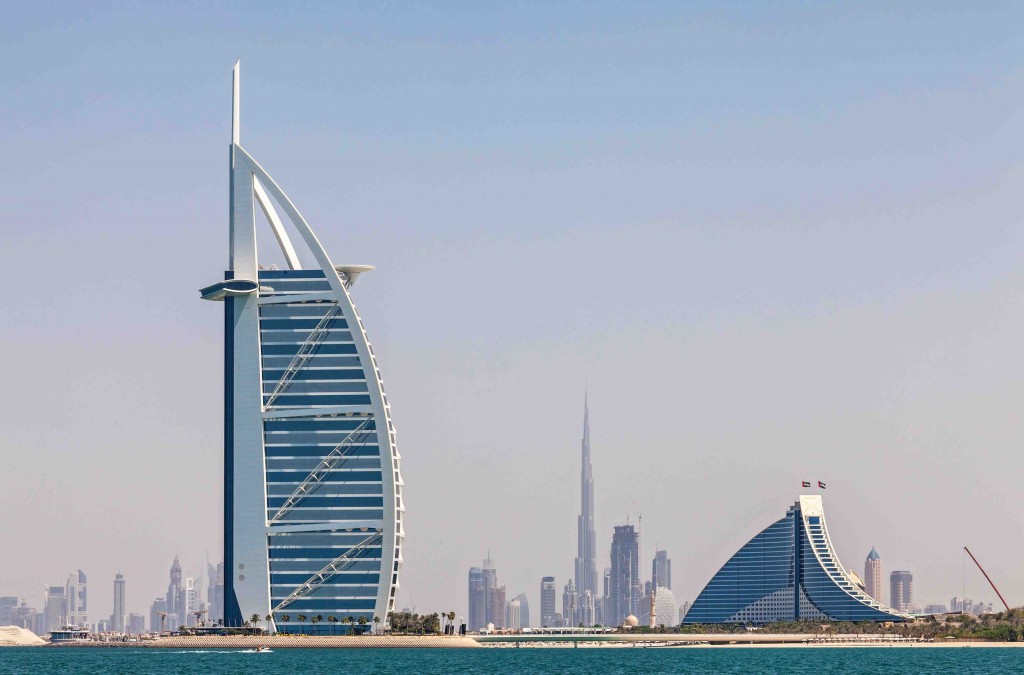
Creating typography for the world’s tallest building is no easy feat. Making a modern font inspired by calligraphy? Even harder. Australia’s Emerystudio[4] wanted to create a typeface for Burj Khalifa that would be ‘distinctive, legible, and harmonious when placed next to Latin letting’. It was Dr. Mamoun Sakkal who transformed Shilia – an existing Latin-complementary design he created in 1978 – into a more modern family called Burj Khalifa Shilia, which is now seriously in-demand for its pretty yet readable nature. Surely there’s no better formula.
Berlin
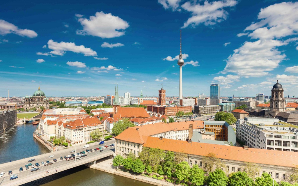
BMF Change is Berlin’s font. It was created by Alessio Leonardi – an Italian designer – for the ‘Be Berlin’ campaign started in 2008. Its simple, lowercase italics can now be found on everything from posters, t-shirts, coins, and even rubbish bins around the city.
New York
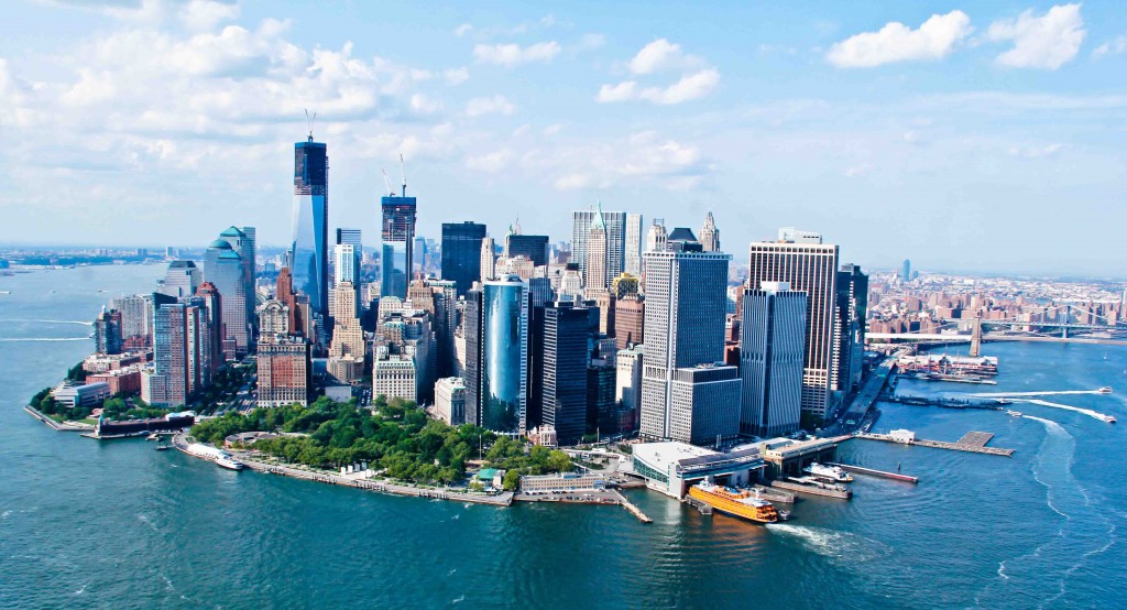
Helvetica has become the font of New York City.[5] Plastered across the subway – the 1950s font is a versatile choice. Though it’s only become the go-to typeface of the subway system in recent decades, that clean, no-nonsense typography – white on black – now screams New York.
Stockholm
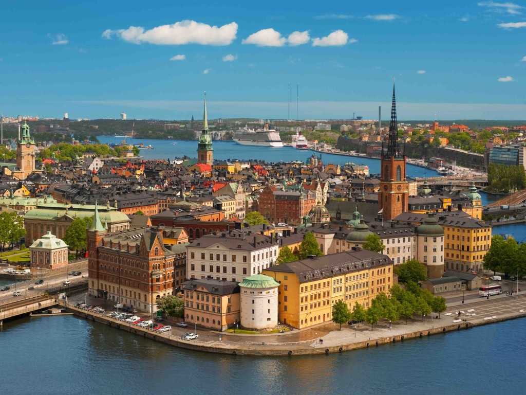
Finally, let’s enjoy a recent refurb of a city. Stockholm was given a new lease of life in 2014[6] with the introduction of Stockholm Type, a font created by Essen International that replaced St. Erik. It’s clean, it’s geometric, it is wonderful. It’s also seen throughout the top Swedish destination, from museum signage to the brochure for Kulturfestival.
A brilliant font can speak the language of a city, which makes it one of the most powerful (and underrated) marketing tool of them all. Which is your favourite?
Is it the same as the UK’s most recognised font? Take a look at our font research to find out what makes us, Brits, so font-happy.
References:
[1] http://www.economist.com/blogs/prospero/2016/06/design
[2] http://gizmodo.com/8-cities-that-have-their-own-distinctive-fonts-1681041888
[3] http://gizmodo.com/8-cities-that-have-their-own-distinctive-fonts-1681041888
[4] https://blueprint.cbre.com/typography-of-place-how-fonts-shape-a-citys-identity/
[5] http://cityroom.blogs.nytimes.com/2008/12/04/how-helvetica-took-over-the-subway/comment-page-2/?_r=0
[6] http://gizmodo.com/8-cities-that-have-their-own-distinctive-fonts-1681041888


