Love it or hate it, the Helvetica typeface is omnipresent these days. But ingenious graphic designers are still finding exciting and unusual ways to breathe new life into this famous Swiss font from the 1950s…
Helvetica Beer
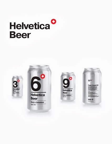
Moscow branding and packaging art director Sasha Kischenko has created this funky concept packaging for Helvetica Beer. The number on each can denotes its alcohol percentage, while the white or black colouring means it’s filled with lager or stout.
Image Source: Sasha Kischenko
Helvetica Bike
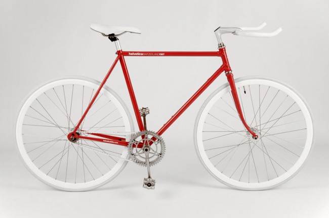
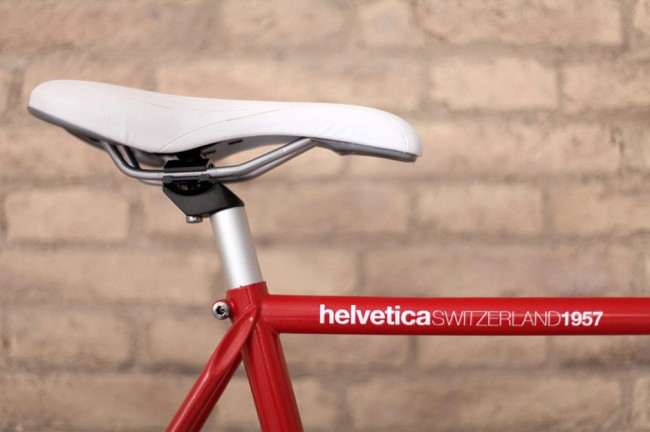
Taking the minimalism and sheer precision of the Helvetica font to the world of cycling was a masterstroke by Spanish design studio Borja Garcia.
Images Source: Graham Smith’s design blog
Helvetica Chocolate
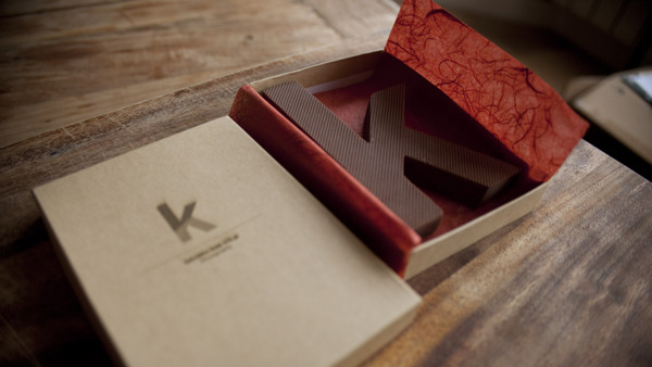
Freelance designer, art director and animator Rosa de Jong from Amsterdam has created Chocography, a tasty way to emphasise the sweeter side of Helvetica’s clean design.
Image Source: Rosa de Jong
Helvetica Face Painting
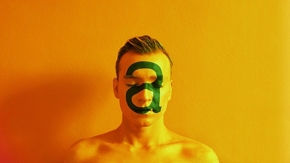
Helvetica face paints probably won’t topple the tiger and T-rex off kid’s face painting wish-lists, but Istanbul graphic designer and illustrator Çağlayan Aktuğ is making a point that it’s wrong to distort typefaces with his Human & Font Anatomy project.
Image Source: Caglayan Aktug
Helvetica Film
Helvetica is a feature-length independent documentary film about typography and graphic design by director Gary Hustwit.
Gary Hustwit comments:
“I thought that looking at Helvetica’s ‘career’ would be a good structure to look at the past 50 years of graphic design, and a starting point for some interesting conversations in the film.”
Helvetica Juice Bar & Cafe
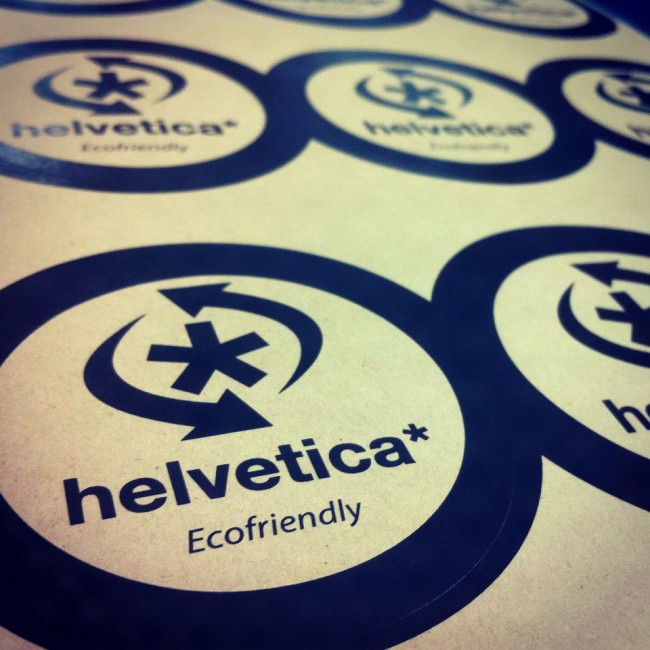
A heady mix of Latin American cuisine and Swiss typography, the Helvetica Juice Bar & Cafe is located in Lakewood, Ohio. This “playground for artists” opened in October 2012 and serves iced and hot drinks in 100% biodegradable, eco-friendly cups.
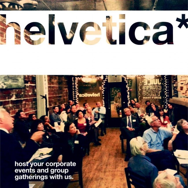
Images Source: Helvetica Juice Bar & Cafe
Helvetica Necklace
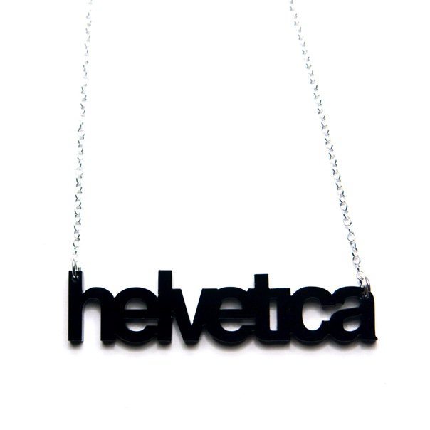
Laser cut into 3mm black acrylic, this Helvetica necklace is sized 63.5mm (width) by 15.25mm (height). The silver-plated chain is approximately 457mm in length. Made by Plastique’s owner Jen Murseby, a graphic designer living and working in San Francisco, the necklace costs $22.
Image Source: Plastique
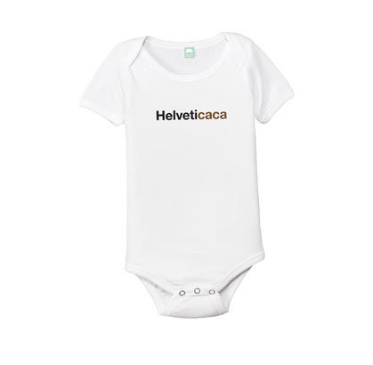
Helvetica Onesie
Row Boat Press are selling this ‘Helveticaca’ onesie, made from 100% cotton, for $15.
Image Source: Row Boat Press
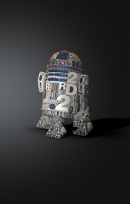
Helvetica R2-D2
French photographer and artist David Benoliel has turned Star Wars’ much-loved R2-D2 robot into a ‘helBOTica’ poster.
“It’s not really complicated,” says David Benoliel on his deviantART page. “I just did everything in Adobe Illustrator. Each letter has been coloured independently to give this aspect of 3D. After I export everything in Photoshop (Smart Object) and create the shadow, background and level/curves.”
Image Source: David Benoliel
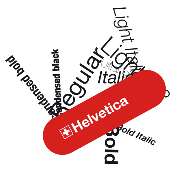
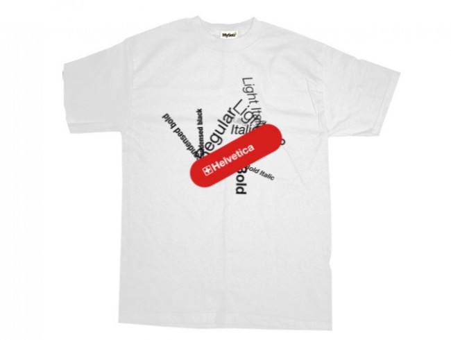
Helvetica Swiss Army Knife
This clever Swiss Army Knife design is part of a series of Helvetica-inspired artwork by French graphic designer and illustrator Stéphane Massa-Bidal, who’s known as Retrofuturs. It’s also available as a white or black T-shirt from MySoti.
Images Source: Retrofuturs
Want More?
Hell-bent on Helvetica? You may also be interested in these fabulous resources for all things Helvetica:
“You’ve probably seen it a thousand times today,” revealed BBC News in their special Helvetica at 50 report.
Sadly, Helvetica only made it to #4 in our clients’ selection of the best fonts for print use. Futura won out on that day. Well, it was Stanley Kubrick’s favourite font too.
According to Wikipedia, Google ran an April Fool’s Day joke in 2011 where any search for “Helvetica” resulted in the unlikely appearance of that much-derided font – Comic Sans.




Love it! This post could go on and on…
Great stuff Rik ! loving the bike!
LOVING the necklace and the R2!
I love the Helvetica R2-D2 and could definitely see myself on the bike! Google’s April Fools Day joke made me chuckle, it is a shame that we can’t do the opposite in the school where I work as all sorts of random documents appear in Comic sans as far too many people seem to be under the impression that it is ‘child friendly’.
The helvetica bike would look much better if it was any other colour. Red is so DejaVu Sans!
Classic font! Nice, clean and simple 🙂
Great blog post! As a designer at a Suffolk website design agency I often use Helvetica, it’s a timeless typeface that can be used across a range of media and looks great for any type of design work. The swiss army knife sums it up for me, every different weight/format of the typeface is a different tool for graphic design work
A good list – I also liked another example that was not included – Hellvetica fire!
http://www.behance.net/gallery/Hellvetica/325221
Good spot! Wonder if they ever made a YouTube video of their HELLvetica Fire?
I just found this on there: “helvetica on fire” http://www.youtube.com/watch?v=u4o-a12OqUo
The helvetica swiss army knife encapsulates the ubiquity and utility of the typeface perfectly.
What a great story about a simple and understated font 😉
Comments are closed.