For the first episode in our new series of short films about typography and different typefaces, Solopress are celebrating the ubiquitous Helvetica font…
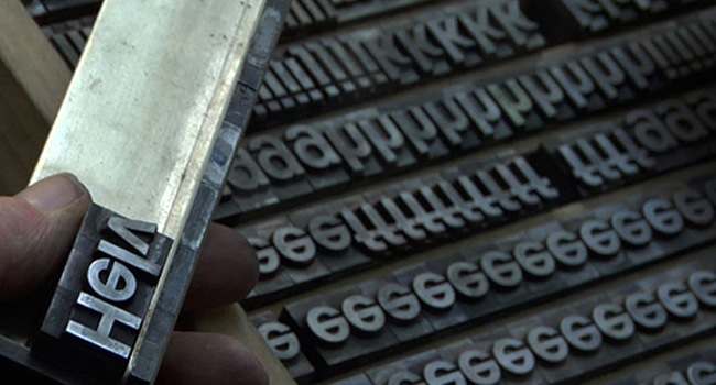
Typefaces practically rule the world, not in a literal sense, but they are part of everything – from typing up your school assignment to a declaration of war. At Solopress we are celebrating one of the world’s most important ever inventions with a series of short films about different fonts.
This video covers 5 Things You Might Not Know About Helvetica:
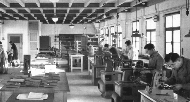
Helvetica is probably the most popular typeface on Earth today, after its invention in 1957 by Max Meidinger and Eduard Hoffman at the Haas Type Foundry, Switzerland.
Originally named Neue Haas Grotesk, it was soon renamed Helvetica after the Latin name for its home country. Switzerland use the font as its hallmark – for example, all government documents are printed in Helvetica.
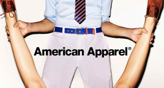
It was quickly swept up by companies all over the world to form word-marks and logos. Today over 40 worldwide businesses us it as part of their logo including 3M, BMW, Lufthansa, Jeep and American Apparel. In fact, American Apparel are one of the most notable users of the typeface,. They usually impose the clean and simple lettering over controversial imagery (as seen in thos advert below).
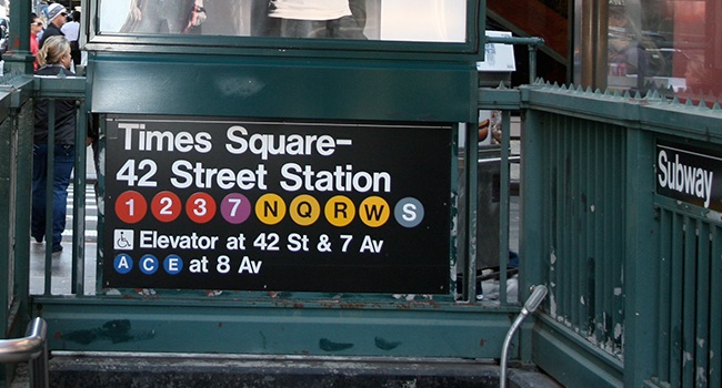
The most iconic uses of the font came in 1980 when MTA (Metropolitan Transit Authority) wanted to change the New York Subway’s tired and confusing signage, which was, at the time, made up of a jumble of different typefaces and styles. Completed in 1989, all signage on the New York Subway is now consistent with its iconic use of white lettering on black backgrounds and its simple coloured circles for displaying different lines.
Like all famous historical figures, Helvetica got its own break in Hollywood in 2007 with its own documentary film about the history of the typeface directed by Gary Hustwitt. It was made to coincide with Helvetica’s 50th anniversary and explored the typeface’s pros and cons from the perspective of designers. Although it wasn’t a major blockbuster hitting cinemas everywhere, after its screening at the South by Southwest Festival in 2007 it received critical acclaim.
But with fame comes hatred, so some designers just don’t like Helvetica. It’s usually packaged with operating systems, and basic productivity and design software, so designers claim it is “too mainstream” and prefer to use custom typefaces out of protest.
So love it or hate it, Helvetica is here to stay and its design power grows ever stronger.
What’s your favourite typeface? Or is there any that you absolutely hate? Shoot us a message in the comments!
This short stop-motion animation was made from over 750 photos and the featured music is: Crazy Glue (Instrumental Version) by Josh Woodward – http://www.joshwoodward.com


