When planning your company’s visual voice, why not consider that added wow factor? Be inspired by this small collection of attention grabbing logo designs.
The use of a carefully planned logo possesses the essential factors in announcing your business to the world.
Take this example from Elefont, a graphics and typeface designer from Hamburg. It’s simplistic in nature, yet cleverly displays the elephant’s trunk within the ‘e’.
By using uncomplicated but effective methods, a successful logo displays either a visual aspect depicting the nature of a business, or an artistic representation of the company name.
The use of hidden images or meanings within logo branding is an ingenious way to ensure that your brand is worthy of a double take. When studying this engaging logo, it becomes clear that the use of imagery has a double visual effect, both reflecting golf and a spartan, which is a shining example of a head turning logo design at its best.
With the face of a lion and a shape of a bird this eye-catching logo uses colour and shading in order to highlight the joint focus aspect, making the image stand out perfectly.
This beautifully artistic illustration compliments the brand, whilst giving a clear indication of the business type.
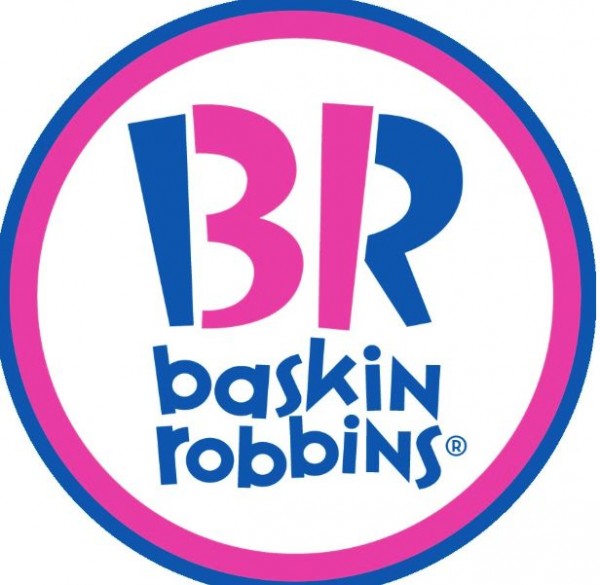
The cleverly designed text in this logo for the popular world wide chain of ice cream parlours, Baskin Robbins, was launched in 2007 after a campaign to modify their branding. The story behind the previous original logo design came about in 1953 when Burt Baskin (Burt’s Ice Cream Shop) and Irv Robbins (Snowbird Ice Cream) joined hands, forming Baskin Robbins and extending their range of flavours to 31, hence the ’31’ forming part of the B an R. The older versions of their company branding placed the 31 as a direct focus point in pink to signify the pink spoons handed out with samples and blue to represent the quality of the product.
With some careful consideration and effective use of graphics, text and colour, company logo designs can be both intriguing, head turning and unforgettable.


These are all incredible. I especially like the Lion Bird logo.
Comments are closed.