You may be shocked and red-faced when you see these epic logo fails – we’re sure the businesses behind the logos are too!
Seriously, what were you thinking? We can’t quite get our heads around these logos. Was it some kind of Freudian slip, or were the designers getting revenge on a tough client?
1. Dirty Bird Fried Chicken
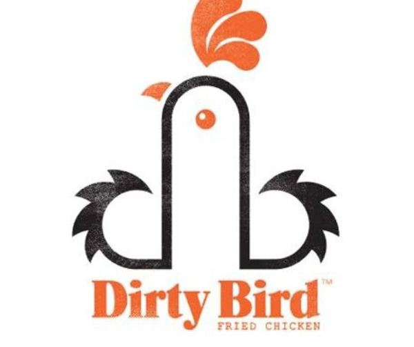
Dirty Bird recently left people squawking over this logo in Cardiff. Customer Abigail Griffiths said,
“I was queueing up with my two young sons when I looked at the logo and realised what it represents. It is not the sort of thing that should be on display around children.”
The flappy bird has also been distributing posters with the wording ‘Touch My Thigh’ and ‘Touch My Breast’.
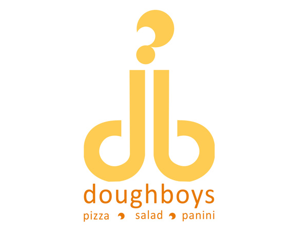
2. Doughboys
This was Doughboys original logo which didn’t go down too well and didn’t last too long. Diana Cabrera was commissioned to design their more tasteful artwork in 2012.
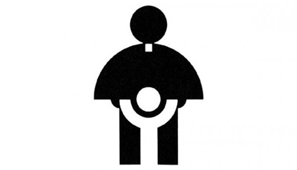
3. Catholic Church’s Archdiocesan Youth Commission
The Catholic Church’s Archdiocesan Youth Commission logo was designed and released in 1973. We are quite confident that this logo will never be released in the 21st century.
4. Arlington Paediatric Center
Would you take your kid there? Just, no. You failed Arlington. Take it down now!
5. Sun Rise Sushi
What could we possibly say about this one? If you look real hard you can see that it’s supposed to be a red sun sitting behind a yellow house. But, let’s be honest, it’s not what any of you saw first.
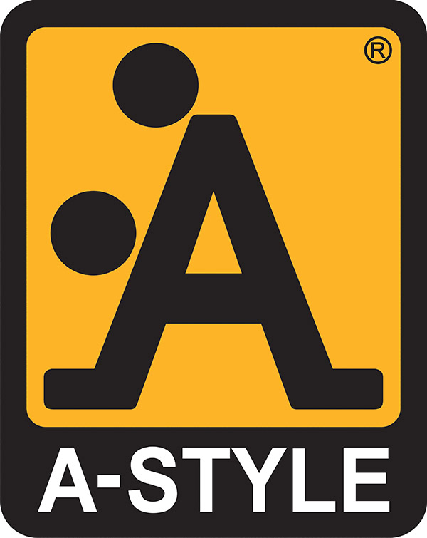
6. A Style
It’s dirty work but A Style are sure to do it. A Style is an Italian clothing manufacturer based in Milan and this logo came before the clothes did, when the company was first established in 1991. This ‘gorilla’ marketing has been long-adopted by the company, with them once plastering this symbol on traffic lights all over Milan.
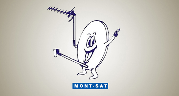
7. Mont Sat
Mont-Sat here, sending all the right signals and demonstrating they have something to be smiling about.
8. The Computer Doctors
They may call themselves ‘doctors’ but there’s no way they can fix that epic error.
9. Mamma’s Baking
That’s one, hot mamma!
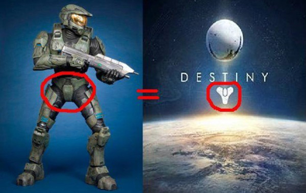
10. Destiny
Reddit user Starboy11 made this wondrous comparison of Master Chief’s groin and the new logo for Bungie’s Destiny. Sam Prell shared it on joystiq stating,
“When you’re an artist inspiration can strike from anywhere. A beautiful scene of nature. An abstract form of clay. The crotch of a cybernetic super-soldier.”








The most scary thing is there are people who got paid to come up with these!
I can’t see how No. 1 Dirty Bird Fried Chicken can be considered a fail in any respect. I think its perfect. No. 3. Catholic Church’s Archdiocesan Youth Commission on the other hand. If that is real, its truly incomprehensible.
Very funny!
What were they thinking is right! but they have made us laugh, thank you for sharing.
Haha, they’re funny!
what were you thinking? Awful item….
Ha! What were they thinking indeed.
Comments are closed.