A bunch of talented artists have thought long and hard about what book covers would look like if they were in charge of the printing, and here’s our top 15 from around the web!
Book covers are the sales advert for the story within, and as much as we shouldn’t judge a book by it’s cover – we all know we do.
Some book covers just don’t live up to the author’s talent, can’t match the story or are attempts by the publisher to categorise the book as a part of their “classics” or “popular” series of books (which no-one wants to display on their bookshelf, I can tell you). The book covers below would take pride of place on any bookshelf.
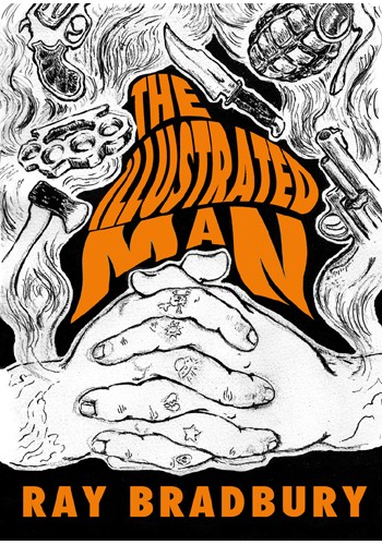
Artist: Micco Caporale
The Joe Pernaciaro-designed cover for Farenheit 451 is one of the most memorable and accurate covers of an important piece of science fiction. This cover competes.
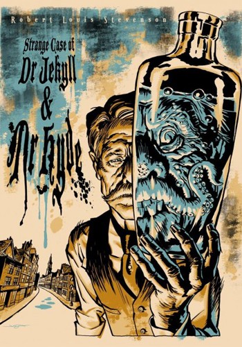
Artist: Jason Edmiston
A gruesome illustration indeed, with a fitting prop to bring focus to Dr Jekyll’s unfortunate condition.
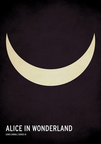
Artist: Christian Jackson
Is it the smile of the Cheshire cat or a lunar hint at Alice’s possible mental state.
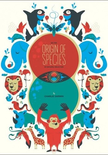
Artist: Delicious Design League
A great way to encourage young minds to read about evolution and how today’s animals and critters of the world are related to creatures of the past.
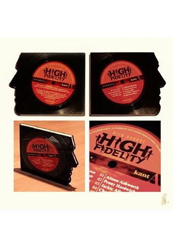
Artist: Hans Kroes
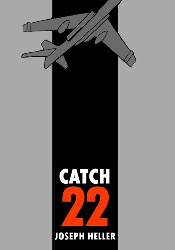
Artist: Kulvinder Dhillon
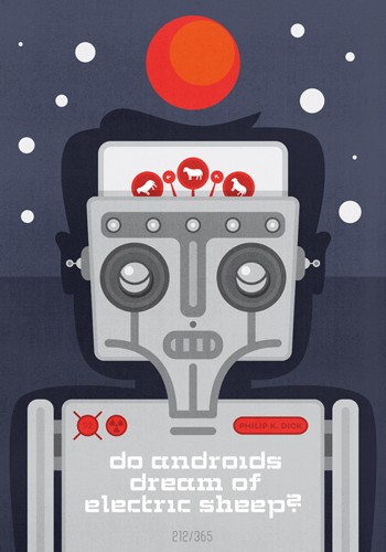
Artist: Hannes Beer
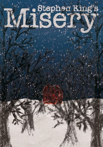
Artist: Manel de Ramón
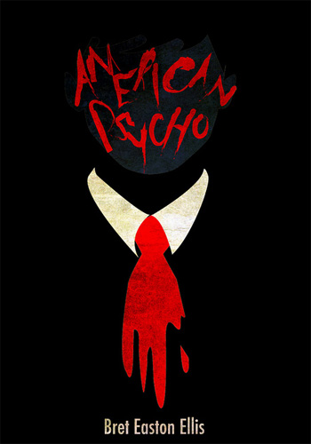
Artist: Shawny Withay
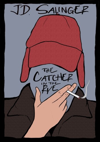
Artist: Beth Elaine Austin
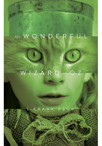
Artist: Paul Bartlett
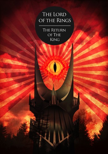
Artist: Jack Fish
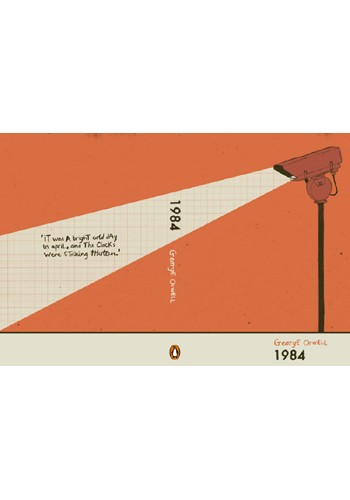
Artist: Luke James
The orange maths book style cover whispers conformity and highlights the opening sentence in George Orwell’s story of a communist nightmare.
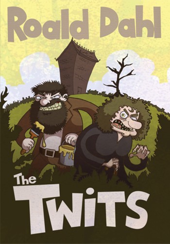
Artist: Craig Munro
A childhood favourite; the cartooned Twits in this version would be more appealing to this generation’s children, than the dated Quentin Blake ones.
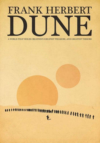
Artist: Paul J. Murray
The ominous planets and the vast desert surrounding a small, but threatening tribe of silhouettes certainly gives an accurate feeling of the what the world depicted in Frank Herbert’s Dune is like.
What’s your favourite design? Do you have a problem with the cover of one of your favourite books, and think you can do a better job? Send it to us on Facebook or Twitter and we’ll mention your idea!


These covers are great as I too am guilty of judging books by their covers.
I really like the Wizard of Oz alternate, it’s creepy yet appeals to an older audience despite traditionally being aimed at children.
I can’t say I like The Twits one simply because Quentin Blake is iconically the Roald Dahl book illustrator!
Wowsers, these are seriously cool. I’m having trouble picking my favourite – I think it’s Alice in Wonderland.
I really like the Doctor Jekyll and Mr Hyde one, very creative and imaginative! Slightly gruesome but it sums up the book pretty well in just one image.
The Roald Dahl Twits one is great. I’ve just started reading Roald Dahl books to my son & much prefer this cover
Comments are closed.