Christmas 2019 is live in all the big stores. For many brands, that means the publication of a Christmas gift guide. An astonishing 67% of people surveyed by Solopress* said that a Christmas gift guide helped them discover gift ideas. With two thirds of shoppers making purchases on the strength of them, it’s no wonder that Christmas gift guides are big business.
We’ve taken this opportunity to cast our eye over some of the Christmas gift guides we’ve seen so far in 2019. We take a magnifying glass to the design choices made by several large retail brands, as well as offering our top tips for your business, inspired by this year’s trends.
John Lewis & Partners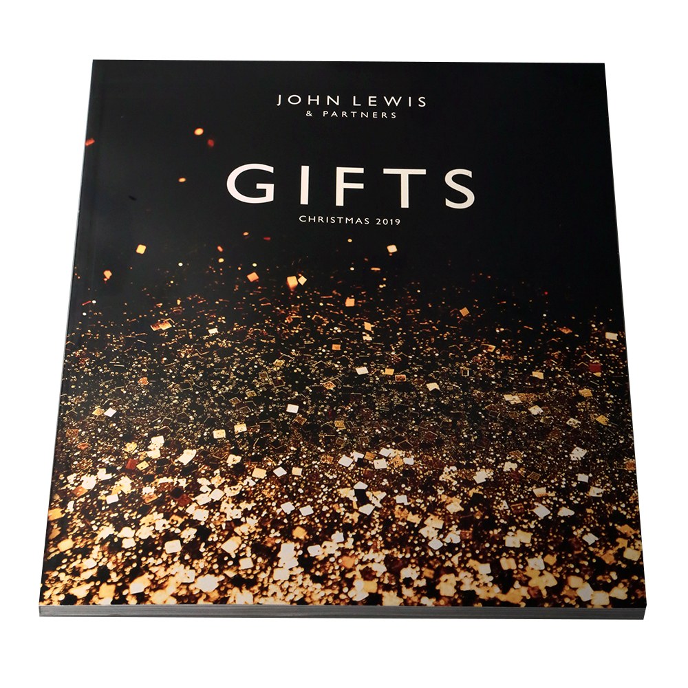
Brochure Type: Perfect bound
Pages: 128
Size: 210 x 260mm
The more well-known the brand, the more understated it can afford to be in its design. Accordingly, this front cover from John Lewis features a minimal word count and precisely zero product images.
A motif running throughout the brochure is the gold confetti that features to a greater or lesser extent in nearly all of the product and fashion shots, and as a graphical element on the cover. Given the gold sparkle theme, it would have been great to see some adventurous finishing on the cover such as spot UV or foiling.
John Lewis are in a unique position. They’ve become established as the bellwether Christmas brand, while approaching last-man-standing status in the large department store sector. It’s great to see the brand pushing on with an original and refined campaign like this one.
Top tip: Even if direct competitors are struggling, it’s important to keep striving. In terms of sales and marketing, compete against every other demand on your customer’s attention and disposable income. In terms of creativity, compete against your own previous efforts.
Next Home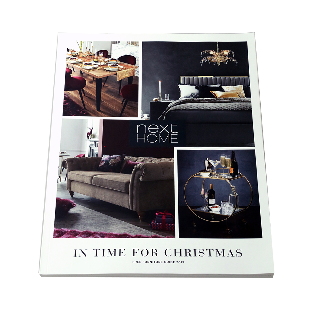
Brochure Type: Perfect bound
Pages: 81
Size: 196 x 278mm
This is a premium piece of collateral that reflects highly on the Next Home brand. They’ve committed wholeheartedly to the “life-style magazine” route – and why not? The cover is simple and elegant, and the dimensions and binding mean you could easily be leafing through a copy of Ideal Home or Décor.
Inside, layouts make it easy to compare products and swatches. The in-situ photography is brimming with interior design ideas that look great and presumably achieve cross-sales at the same time.
Other than a mention of Christmas and some subtle visual references on the cover, there’s very little that’s festive in the design or content. But when you’re selling high-ticket items for people to appreciate all year long for years to come, it’s probably best not to overdo the tinsel.
Top tip: Genuinely interesting, informative and entertaining content will always win out. And that content doesn’t need to be copy. Photography that wouldn’t look out of place in a lifestyle magazine is what makes this Christmas gift guide so satisfying to leaf through, and so tempting to buy from.
Argos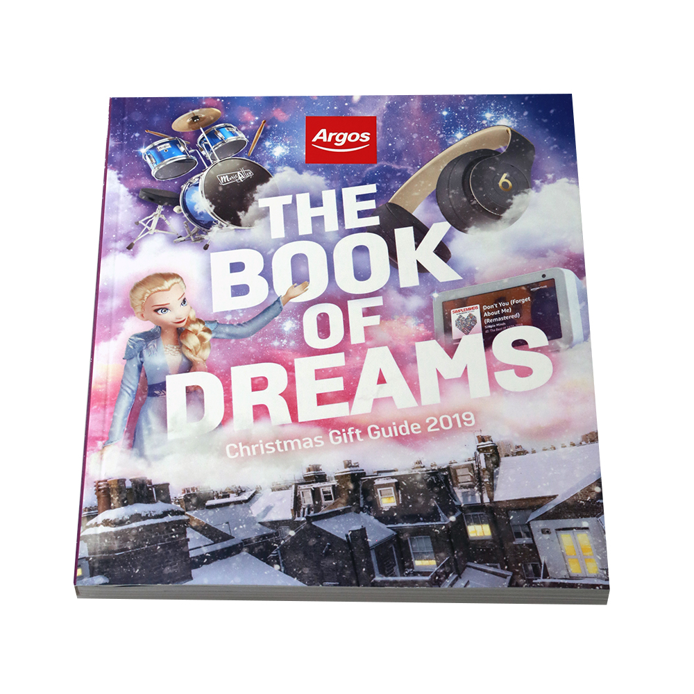
Brochure Type: Perfect bound
Pages: 228
Size: 182 x 222mm
This brochure is the central piece of collateral in a much broader Christmas campaign. Argos have done a great job of creating a buzz around the release of their gift guide, touting it as an important milestone in the run-up to Christmas. By naming it “The Book of Dreams”, they recognise their place in the childhood memories of a great deal of their audience.
There’s a considerable marketing push behind this year’s guide that has included press, TV and outdoor advertising. But the real stroke of genius has been to make every catalogue from 1974 to the present available to browse on their Book of Dreams website.
Not only is it great fun to browse the toys and tech of yore – it’s an effective reminder of the colossal heritage that this brand can bring to bear.
Tip top: We don’t all have the history that Argos has, but finding imaginative ways to link your gift guide with other online and offline activity can help create a holistic experience for your customer.
Boots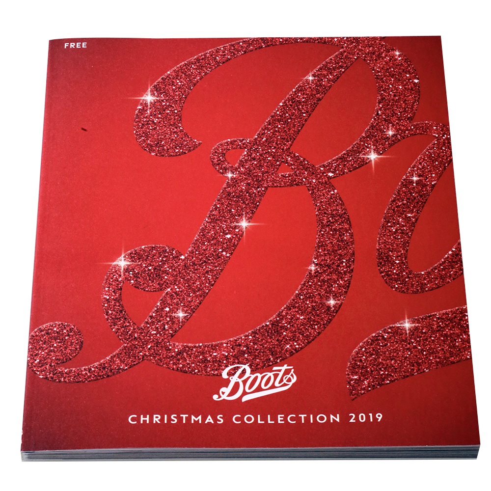
Brochure Type: Perfect bound
Pages: 144
Size: 200 x 239mm
Boots is an enduring presence on the high-street, and brand heritage seems to be a big part of that endurance. This gift guide ties into that perfectly.
We love the confidence with which they’re able to feature about a quarter of their wordmark and no products whatsoever on the front cover – and we still know exactly what this is. Doing away with “Boots” in white at the foot of the page would have been bolder still.
The mat finish and quality paper stock makes for a reassuringly substantial tome. Across 144 uncluttered pages, Boots lay down their product range in grand style. Not only is the design confident, it inspires confidence among its audience.
Top tip: Think hard about whether your approach achieves the right balance. Be bold but not brash, confident but not arrogant.
Lakeland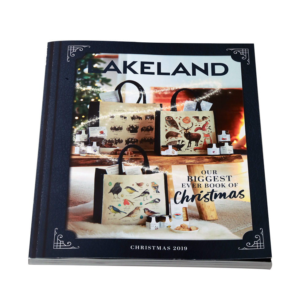
Brochure Type: Perfect bound
Pages: 206
Size: 190 x 248mm
A hefty 206 pages, this perfect bound brochure is substantial and stylish. The high standard of imagery throughout the brochure certainly warrants a special mention.
The range of images includes simple pack shots, cropped products with drop shadows and reflections as well as creative in-situ photography. Mixing it up like this adds variety, while consistent motifs like the art nouveau corner flourishes tie the brochure together from cover to cover.
Speaking of the cover however, the “L” in “Lakeland” is partially obscured by the background. That’s a shame from a branding point of view, as it camouflages the entry point for the reader. Luckily, pretty much everything else about this gift guide is on point.
Top tip: When introducing key text into a design, always try to present a clean entry point – a very clear way for the eye to identify and start of the text.
Build-a-Bear Workshop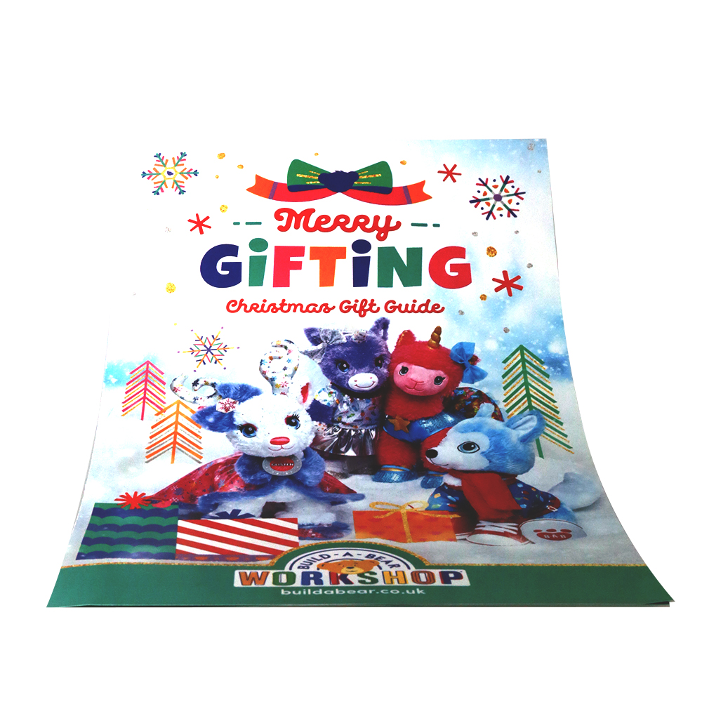
Brochure type: Folded
Pages: 4
Size: 140 x 214mm
This folded leaflet from Build-a-Bear is a far more modest entry into the gift guide selection. It’s a 4-page folded leaflet printed on a lightweight paper stock that would have been simple for a designer to have created and sent to print.
The inside pages do a good job of calling out the product range, highlighting the various franchises and themes available. In truth, this is an acclaimed store with a strong, functional name that means their brand does a lot of the hard work for them.
The best-kept secret about this leaflet is the £10 discount voucher on the back. Maybe they could have called attention to this on the front cover!
Top Tip: Producing a Christmas gift guide can seem like a daunting prospect, but here a hugely successful global company in Build-a-Bear has shown that they don’t all have to be catalogue-sized brochures. If your time and budget are limited, consider featuring just a few of your best-selling products in a smaller guide that makes the whole process more manageable.
The Works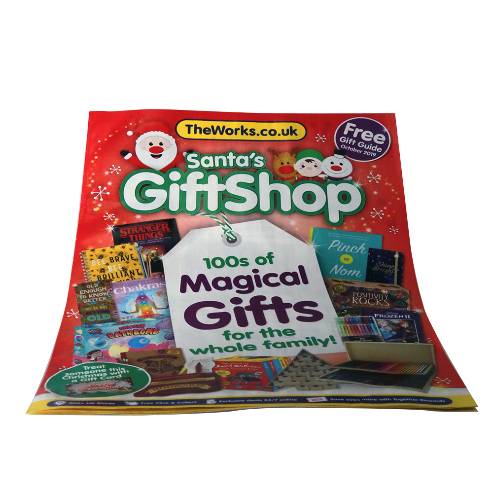
Brochure type: Glued
Pages: 16
Size: 148 x 210mm (A5)
This is another Christmas gift guide that demonstrates not all brands need to push the boat out with a thick, glossy brochure.
The lightweight paper stock and lower page count save on space and cost, while the design makes the very most of the limited space. From cover to cover, this gift guide displays a cheerfully busy layout – jam-packed with character illustrations, colourful packshots and multiple sales messages.
While the whole thing is a bit of an assault on the senses, it puts across an inexpensive vibe that will appeal to bargain hunters at Christmas. And really, if The Works had produced a hundred page perfect bound brochure, it might feel inappropriate and nowhere near as much fun as this.
Top tip: Be honest and realistic with your brand, maybe even try some research to explore how your brand is perceived by independent observers. Pitch your gift guide accordingly, and remember there’s no shame in representing good value.
The Entertainer (TheToyShop.com)
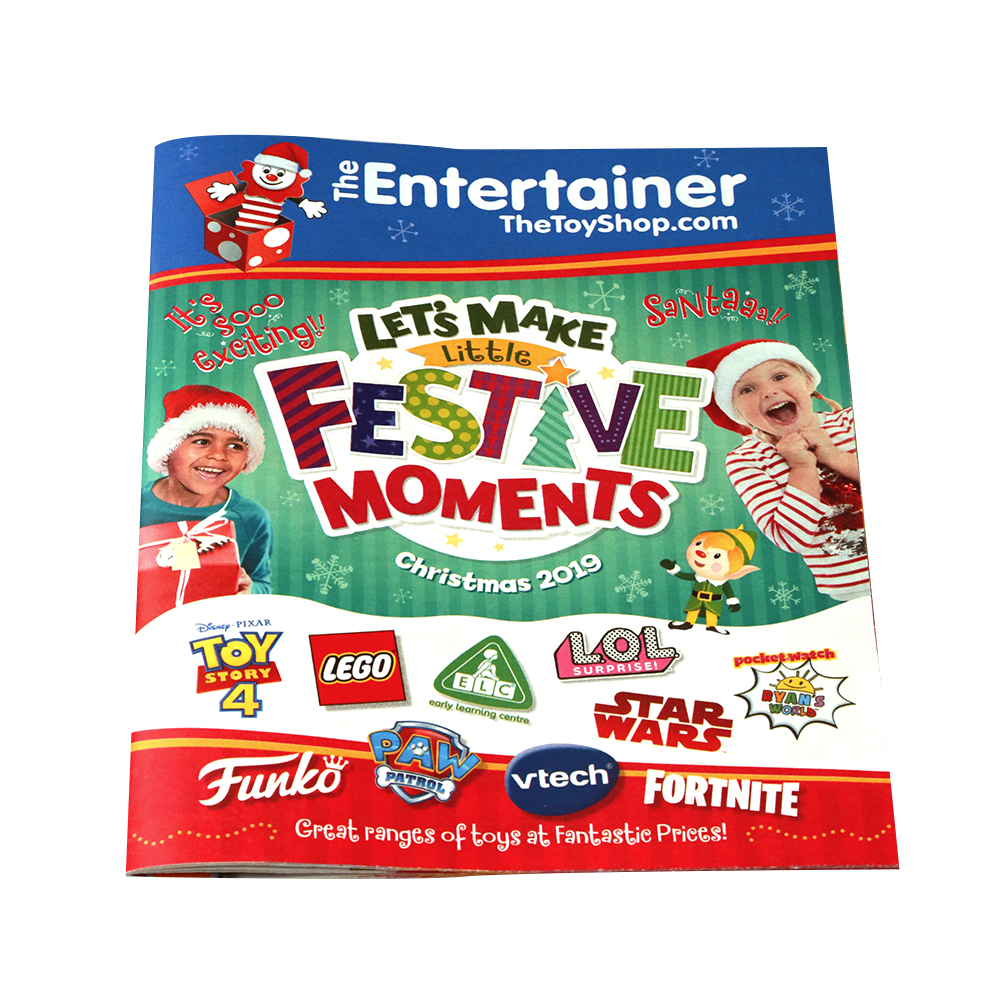
Brochure type: Stapled
Pages: 56
Size: 187 x 240mm
Fun and bright, it’s another busy cover design for sure, but successfully so. That’s partly down to how the content has been compartmentalised in separate strips in this stapled brochure.
We have the brand title treatment in the headline space at the top of the cover – although the dual branding of “The Entertainer” with “TheToyShop.com” is slightly confusing. Below, there’s the Christmas branding together with its own title treatment. Then come further product logos and the space occupied by the tagline the foot of the page.
Overall, there’s probably a lot going on here, but the sections help to make sense of the messages.
Top Tip: When you have a lot of brands, products and messages to present, look at how partitioning your space into different sections can make it easier for the reader to grasp what’s going on.
The Fragrance Shop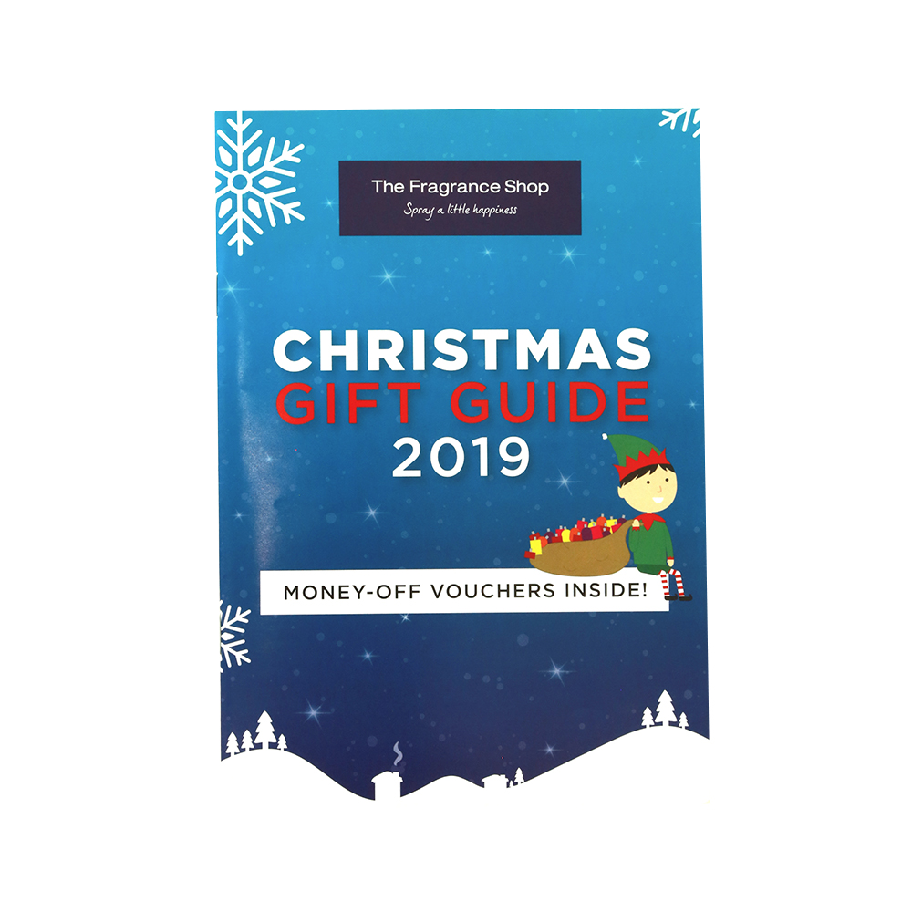
Brochure type: Perfect bound
Pages: 40
Size: 148 x 210mm (A5)
The Fragrance Shop has a very clean and crisp aesthetic outside of Christmas, but they’ve not shied away from mixing it up a bit for the festive period.
The shades of blue accented by simple white illustrations, along with the sparing use of red text is the look that extends across all of The Fragrance Shop’s online and offline Christmas branding.
So far so good, but the little elf does look as though he was inserted as an afterthought to jolly things up, suggesting their confidence in elegance and simplicity may have wavered slightly. The voucher message that he’s sitting on is sure to be a strong draw for customers, though!
Top tips: Christmas is the time when you can relax your branding to an extent, but don’t lose sight of your enduring aesthetic and your core values.
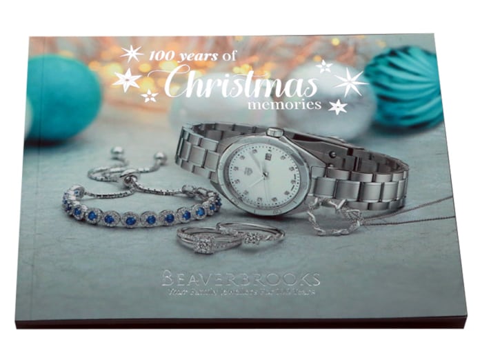
Beaverbrooks
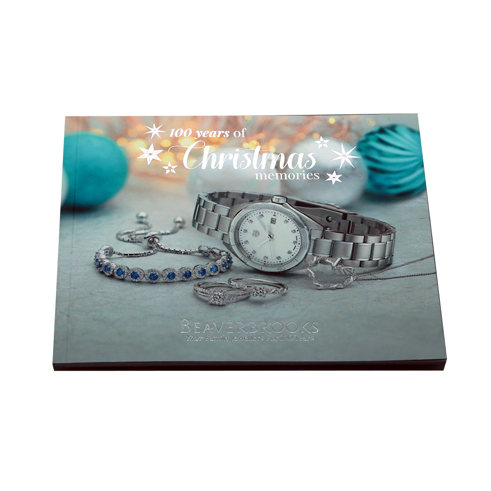
Brochure type: Perfect Bound
Pages: 40
Size: 155 x 125mm
Now we’re talking. Silver foiled lettering. Handbag-friendly dimensions. Beautiful photography. Consistent colour theme from cover to cover with teal accents peppered throughout.
The high production values reflect the prestigious quality of the products on offer. Relatable customer case studies take that level of prestige and bring it closer to home.
This Christmas gift guide is small and precious, just like Beaverbrooks‘ product range. It’s entirely possible that the savings they made on brochure size allowed for the effective foil printing on the cover. By devoting resources into perfecting this piece, Beaverbrooks have produced an absolute gem.
Top tip: Maybe size doesn’t matter? Try something smaller and explore how specialist print like spot UV or foiling can elevate your brochure.
* data gathered as part of the Solopress 2019 Christmas Survey. All statistics shown are based on the responses of 100% of the 1204 respondents. Data gathered through the survey remains the property of AGA Printing Ltd trading as Solopress Ltd and may not be reproduced without acknowledgement via back link. All copyright and other intellectual property rights are reserved.


