The print process
When a file is prepared for print, it’s set up using a four-colour system known as CMYK (cyan, magenta, yellow and black). But, Pantone colours can also be considered for certain requirements.
When printing, an image is made up of hundreds of different combinations of these colours. They’re built up by passing through a press, which picks up the different colours individually to form the desired shade. Whether printing on a digital printer or offset lithographic printer, the colours are made up exclusively of CMYK, also known as four-colour or process printing.
But there are some colours which simply cannot be recreated using the CMYK colour process. For these, you can opt to use a spot colour or Pantone colours.
Pantone colours
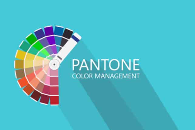
Pantone colours are very similar to paint swatches you see at DIY shops. There are hundreds of varying shades and depths of colours, each with a number assigned for identification. These shades are created by mixing from a palette of 14 base colours – like mixing paint, but the process is very specific. Each colour comes with a particular recipe which involves the ink being weighed out to a precise amount in a certain order and hand-mixed by the print operative. Alternatively, most colours can be purchased pre-mixed.
Pros and cons
To create colours, a print machine needs to know the exact balance of CMYK to create the correct shade. One of the benefits of using Pantone colours is that guesswork is completely removed as it’s already mixed and will print the exact desired hue. Standardising colours means that from one printer to the next, you can be sure of consistency and continuity in your prints, especially if using a specific shade. That’s not to say that CMYK printing is inferior. As print technology has become so advanced, it’s easy for CMYK to get it right in most instances.
Spot colours are beneficial if you want to create a specific brand look. Take McDonald’s for example – the bright red used in their branding is a spot colour. This makes their logo easily recognisable. By using spot colours in your branding you can create a definitive colour palette that’s consistent across the board.
The drawback of using Pantone colours is that due to the materials and procedure required to use them, they do cost significantly more than four-colour printing and can extend lead times. At Solopress we believe in low-cost printing and fast turnaround. Where possible we’ll try to recreate Pantone colours using CMYK. It’s entirely possible, but it’s unlikely the colour will be exactly the same. We offer a proofing service, so you can see our colour match before going ahead with your order.
Over to you
The decision whether to use Pantone colours or CMYK is not an easy one. There are benefits and drawbacks to both. Pantone comes at a higher cost whereas CMYK can’t guarantee complete colour accuracy. If you have questions or would like to find out more about using the Pantone colour matching system, get in touch with the team who will be happy to help advise you.


