
Design trends for print come and go, often taking inspiration from the style of the day.
While some layouts and principles remain constant, certain colours and fonts will fade in and out of favour throughout each year. This is especially true with brochure printing trends, as companies and organisations want the most cutting edge look to reflect what they do. The following are a few popular choices and fads that stand out as popular right now.

Popular Principles
When it comes to brochure printing trends, we can’t get enough of the clean, crisp look in general. It suits virtually any purpose, is clutter-free and makes a maximum impact on the reader. Throughout 2014 and into the new year, popular requests include modern black covers for products like perfect bound brochures, paired with bold colours inside.
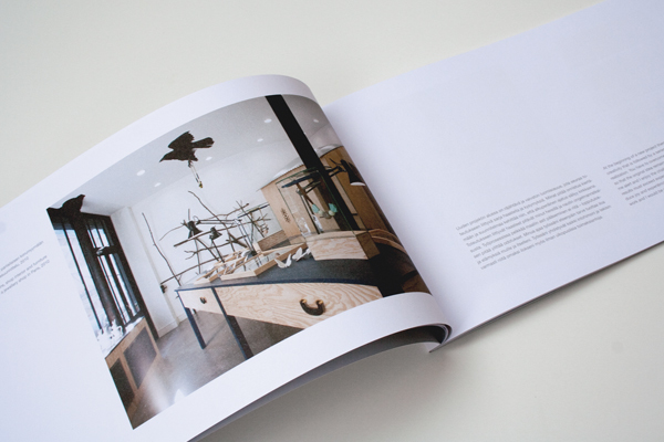
Flat design for icons and artwork has remained hot lately, but for those who prefer photography, large high-resolution images are key. Another well-liked design feature is the use of geometric shapes in brochures, which can highlight bits of text and add something to the overall layout.
Typography Trends
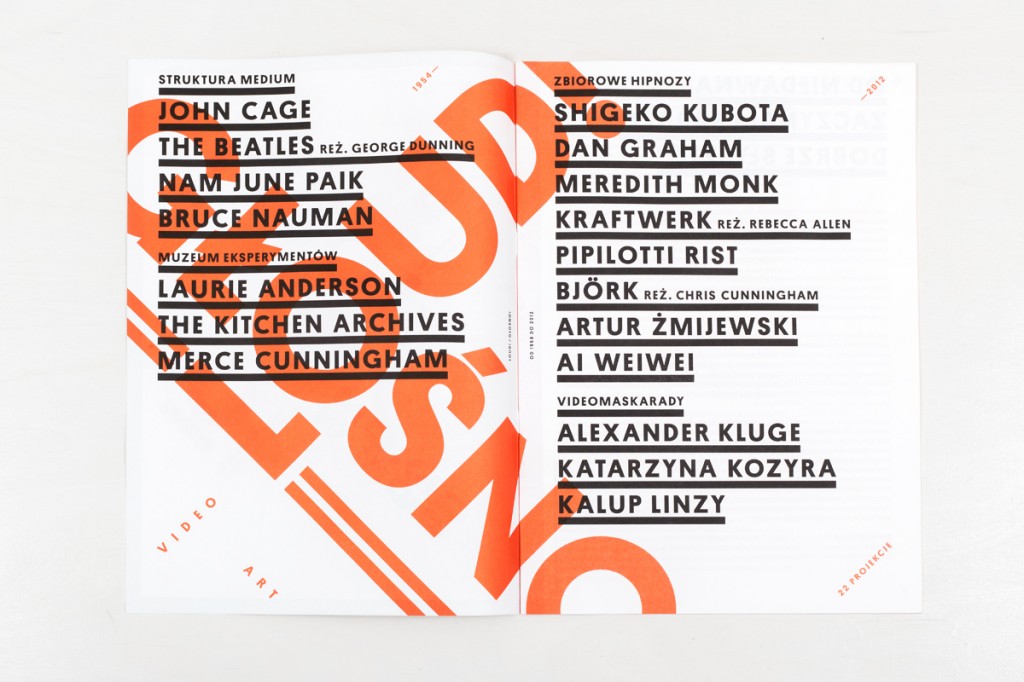
As far as text is concerned, sans serif fonts have been chosen often lately, making a statement when laid over top of imagery. Any focus on typography should be as clean and minimal as the images and design themselves.
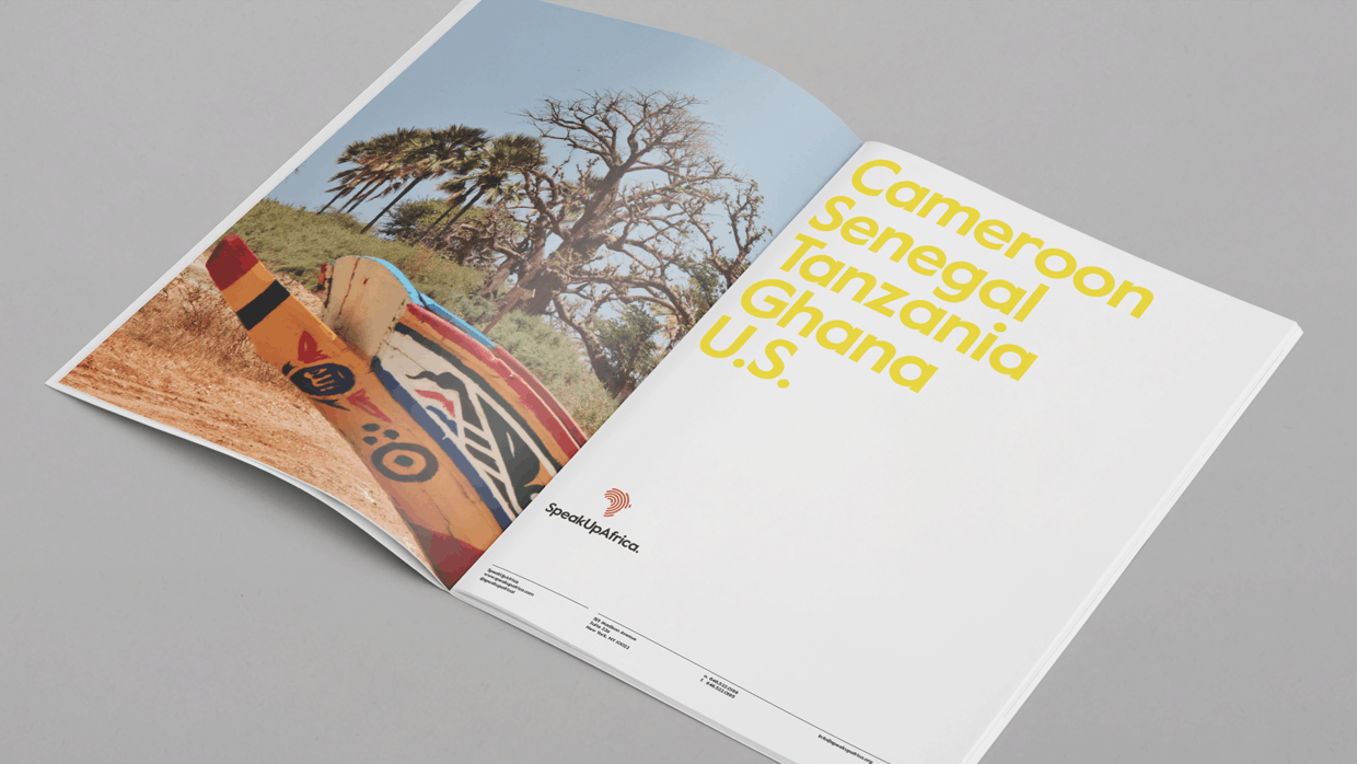
Another up-to-the-minute idea is using a text-only design, which is distraction free and sends a clear message. It’s an excellent choice for powerful and significant statements. For example, the “typography lock up” look remains popular for brochures as well as other print such as book covers.
Iconic Imagery
In addition to the hot looks already mentioned, like flat design or the use of geometric shapes, other specific uses of imagery have been especially popular recently. As much as many people are gravitating towards looks like typography lock up, others enjoy the appearance of image-only designs. Done right, they have the power to speak for themselves, without the use of text. Image-only looks can express more meaning than ones with typography added in. They’re also clean and clutter free.
Nothing At All
And as popular as certain typography and imagery choices are right now, another principle of design is also important to remember; the use of white space. Brochure printing trends for 2015 include plenty of white space, which gives the finished design breathing room and ensures the details don’t get lost. So while you must decide carefully what to include in your brochure layout, it’s also imperative to consider when something should be left out.
Fads For 2015
There are three buzzworthy print and design fads right now that everyone is taking about. In some instances, they may even be able to work together!
First, the use of nature photography is hotter than ever. High quality nature photography conveys emotion and can work for virtually any industry. It looks particularly striking in brochures.
Second, the use of double exposure is an edgy design concept that some brave folks are gravitating towards. Done right, it makes for a dramatic look.
Finally, whatever design or typography style you’ve opted for, luxury print is the name of the game this winter. Triple layer print products and luxurious details such as embossing, foil blocking and spot UV treatment are in demand for brochures and other products, like flyers.


