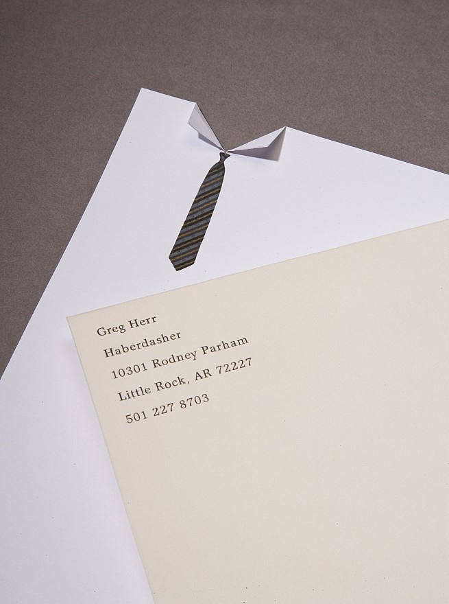
Email may be popular, but some moments just call for print. When you need to make formal contact with a business associate or client, great letterhead design is essential.
Why Letterhead Design Is Important
Several reasons.
- An appropriate (or inappropriate) design can convey a strong signal that reflects on how people perceive your company.
- Letterhead is part of the package that furthers your branding, alongside your business cards, flyers and other promotional print materials.
- Great letterhead design sets the tone for your message – whether it’s serious, sales focused, congratulatory and so on.
Remember What You Must Include
Be choosy about what you want to actually put into your letterhead – and have it all narrowed down in detail before you need to have them printed. Including your company name and logo in your letterhead design are essential, as are your contact details. With contact information, however, you may want to consider whether to place it in the header or the footer. Other potential details to include are your company slogan and social media handles.
Know Your Branding
If your company’s corporate identity includes a specific palette of fonts and colours, stick to them. This isn’t the place to deviate from standards; consistency is key. Otherwise, your letterhead design should include a limited range of colours and no more than two fonts, all of which remain complementary with the type of business you run and how your logo is designed.
Keep It Simple
While you do want to include all pertinent information in your letterhead design, you should also avoid the trap of cluttering it up. White space is as essential as the information you include, and an overly busy letterhead containing too many details will just become confusing for the reader.

Carefully Proofread
Not just on the computer screen, either – you’d be amazed at how different things can stand out when your letterhead is printed. Read through for spelling errors or “typos”, of course, but also check out potential issues with spacing, punctuation and even mistakenly including incorrect or outdated information. A good printer will proofread for you, but you’ll never regret double or triple checking your letterhead design yourself before you send it for production.
Think Ahead
Thinking of the future is a point that some print customers overlook. Is your company planning on moving to a new office in the next few months or year? Have you been actively seeking quotes to install a new telephone service? If any of your key contact information may be changing soon, you may want to print in a slightly smaller batch of letterhead now, then print more once your information is updated. That way, you’ll cut down on potential waste. After all, you can also order a short run of more letterhead, but you can’t do much with old stock.
Like most aspects of business, getting the most out of your letterhead design and print comes down to simple planning and double checking. Do it right from the start and you’ll have stationery that makes a great impression for your company!


Excellent tips. It is so important to have a good looking letterhead, and so I often advise people to have a professional look over your design before you have it printed.
Comments are closed.