Election time brings about fierce debates, campaigning and a collection of political leaflets that try to grab voters’ attention. Creating effective campaign leaflets is all about getting the design right – to help catch the eye of the electorate.
We’ve compiled some of the most effective designs we’ve seen from Election Leaflets. All leaflets included here are not an endorsement from Solopress of the politicians, parties or opinions they promote.
Read on for our chosen examples of election leaflets – or browse our own flyers and leaflets right away.
1. Conservatives
When: European Elections 2019
Issued by the Labour Party in 2013 – this leaflet was delivered in Oxford East.
Image Source: https://electionleaflets.org
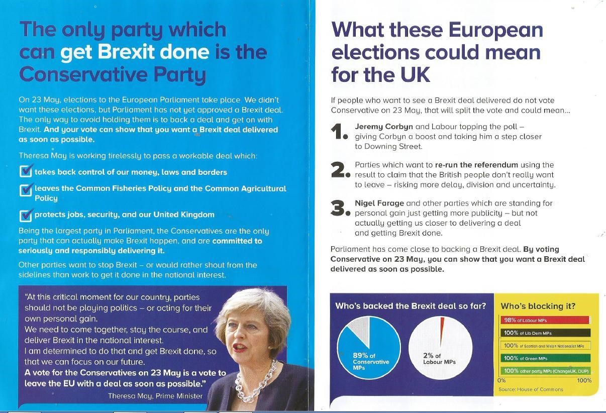
For the European Elections, the Conservatives produced a prime example of how to balance headers, text, images and graphic elements.
The leaflet design is more effective than the Tories’ actual performance in these elections. But despite this, it does a very good job of breaking down key information for the scan reader and detailing the policies that proved (this time) unsuccessful at the ballot box.
Though it perhaps doesn’t have the visual impact of some of the others in this list, the use of different font sizes helps to keep the reader engaged with the high volume of text.
There is a nice use of yellow in the corner when highlighting an important stat – a bold choice that breaks away from the traditional Conservative colour scheme.
2. Labour
When: General Election 2017
Image Source: https://electionleaflets.org
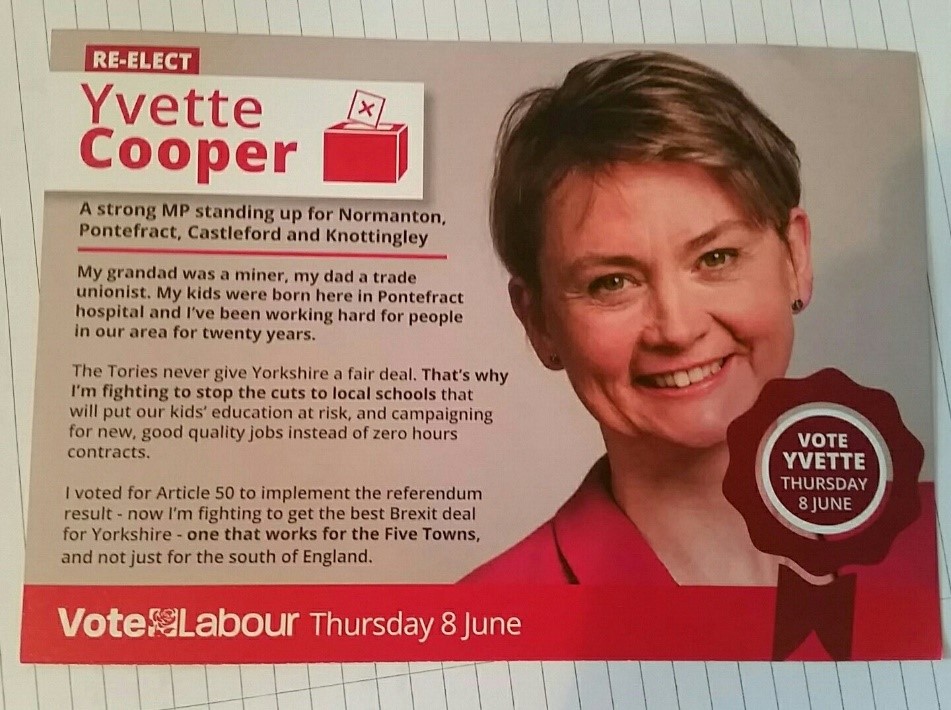
This is a brilliant template for Labour’s candidates, with a prominent red colour scheme and effective portrait image that puts a name to a face.
The goal of this election leaflet is clear, with dates, names and voting information clearly marked with an additional CTA.
Though the text may be a little too wordy in places, it effectively lays out the information a voter would need when deciding who to vote for.
While the use of bold text in certain parts is effective at making sure important, take-home points are displayed clearly.
3. SNP
When: General Election 2017
Image Source: https://electionleaflets.org
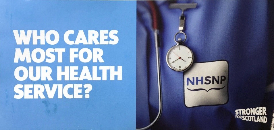
Strong, striking and simple. The SNP opted for a minimalist design that is light on detail but says everything voters need to know about their main campaign pledge.
Design expert and Professor of the Creative Industries, Phil Cleaver, explains the importance of a clear message.
He says: “Voters should have a clear sense of who they’re voting for and the policies they are looking to see come into effect.
“Aligning your political message to appropriate visual communication helps to strengthen the credibility of your claims.”
The SNP takes an approach with branding that incorporates not only their country’s and NHS colours, but also clearly indicates what they stand for as a party.
4. Plaid Cymru
When: General Election 2017
Image Source: https://electionleaflets.org
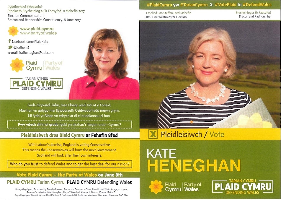
A unique entry, in that it’s the only one which features two languages on a single leaflet. Plaid Cymru has catered to the portion of the electorate who speak Welsh.
Alongside this, they’ve provided information in English too, which covers their entire voter base.
Political parties need to engage with voters, and Plaid Cymru have done this, by adding Welsh text and focusing on a portion of their support base that may have been neglected in the past.
This focus on making communication clear is effective, as Radim Malinic, Creative Director at Brand Nu, puts it.
“We only buy into politician’s messages when we can understand their narrative. They need to express this and tell a story that excites people.”
5. Labour
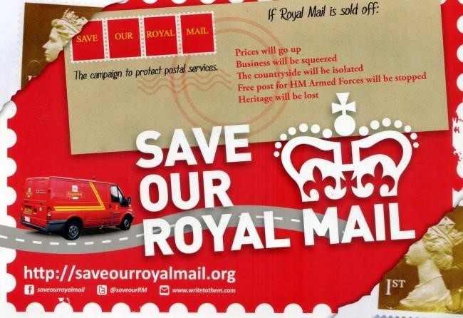
When: Save Our Royal Mail campaign, 2013
Labour released this leaflet in 2013 and, although the campaign was ultimately unsuccessful, the leaflet has left a lasting impression.
The leaflet prominently displays the URL of the campaign website, which acts as the main CTA for those wishing to learn more about the campaign.
Most impressive perhaps, is the displaying of social media links to their Facebook and Twitter pages. This is essential for political parties to gain support at a grassroots level, as Phil Cleaver states.
“Optimising marketing for the web is important for relevance. Platforms such as Facebook and Instagram are becoming major platforms for advertising, particularly with younger voters.”
By having gateways to learn more information and promote voter engagement, people can be provided with updates regarding the Royal Mail’s privatisation.
Read more from Phil Cleaver at our Politics Rebranded site.
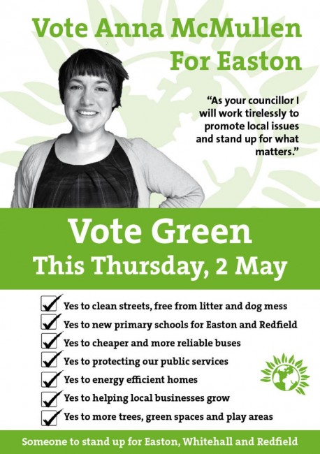
6. Green
When: Council Elections 2013
This Green Party entry is a fantastic example of how to write an election leaflet. It manages a near-perfect balance of text and imagery – with a strong design layout to help entice the voter into reading more.
As with the clear red in the Labour leaflet and blue in the Conservative flyer, the use of green in their branding is a no-brainer.
The party also reflects their beliefs by printing their election leaflets on 100% recycled paper, using environmentally-friendly vegetable inks.
Again, this goes back to knowing the unique selling points of your party, maintaining brand consistency and letting the voters know they can trust the candidate.
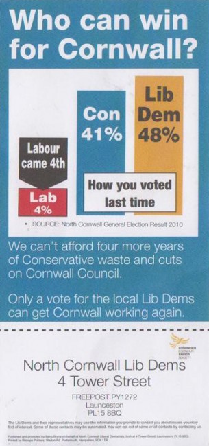
7. Liberal Democrats
When: Council Elections 2013
Issued by the UK Independence Party (UKIP) in 2013 – this leaflet was delivered in Oxford West and Abingdon.
The Liberal Democrats have a recognisable colour scheme strongly associated with their party. This leaflet moves away from it slightly, favouring a blue background.
But the impressive thing about this entry is the usage of a graphic element, which breaks from text-heavy formats.
There’s also the helpful addition of a perforated edge, which handily supplies the party headquarters address – perfect for anyone looking to learn more about their policies and activities.
The Lib Dems have made it easy for people to actively interact with the party, helping to drive support from the electorate.
Looking for election leaflets? Explore our election printing page for leaflets with free next day delivery.


