Parallax websites are a great, interactive way to tell a story or display multiple items in a particular order without the user having to leave the page. Typically, the user controls the page by scrolling down with the mouse. It’s a really good way to showcase HD photography, short videos and beautifully crafted vector graphic designs.
Parallax scrolling websites are the latest trend in website design. In essence it’s the displacement or difference in the apparent position of an object viewed along two different lines of sight. This is something that can be seen in some side scrolling platform video games.
Common effects are background images seemingly moving behind a layer of content, or items moving and changing over the top of a background. Parallax has been slightly controversial, as it’s often used in the wrong places, causing much frustration!
Here’s a few examples of some good use of parallax design, by some really talented people.
1.) Apple’s New Mac Pro

Apple are always at the forefront of beautiful design. This example of parallax is probably the most well known. After watching it you’ll want to remortgage the house just to get one of these blindingly powerful machines.
2.) Killing Kennedy – National Geographic
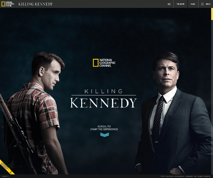
This is by far one of my favourites. It ticks all the boxes, educational, functional, smooth, fast and extremely well thought out and designed. It’s a full experience with movies, audio, photographs and graphics. Even if you’re not into the magic bullet theory, this is still one to check out.
3.) FiftyThree’s Pencil
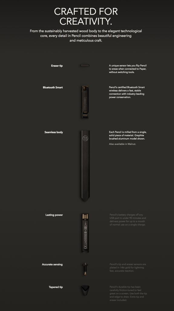
FiftyThree the developers of Paper for iPad have released Pencil, a seemingly ordinary piece of wood shaped as a stylus, which actually has some pretty intricate innards. A great looking design tool presented with great web design!
4.) Robby Leonardi’s Interactive Resume
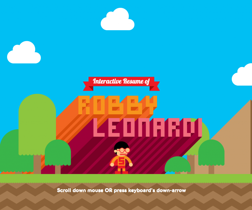
If you’re a web designer or developer it goes without saying that your online resume should reflect the acme of all your skills – and boy does Robby Leonardi’s. Made to look like a HD vector sidescroller reminiscent of the SNES or Sega MegaDrive, this website almost guarantees Robby work!
5.) Stop Visual Pollution
This is an demonstration website from Team Treehouse. Treehouse is a fantastic educational organisation, you can learn how to run a business and better understand design concepts and software. Their primary goal however, is to teach hopefuls how to code web apps and websites. You may have seen them in the news recently – their CEO’s successfully removed all their managers and are running as a flat company. What a great business model! You can grab 50% off your first month with Treehouse by clicking the graphic to the right, for a paltry amount a month you can grab a practical education with the support of skilled teachers and a great community of users.
6) Highway One – Exsus Travel Tonic
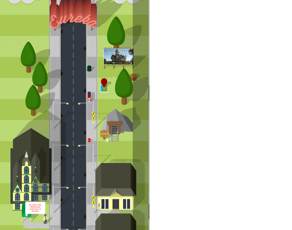
Exsus Travel have launched this beautifully designed and well thought out promotion for their Highway One cadillac experience. You can get a taster of the adventure by scrolling down through various towns and cities on the route, with quirky extras such as the radio guide and other interactive elements such as mailboxes and maps!
7.) Fixedagency.com
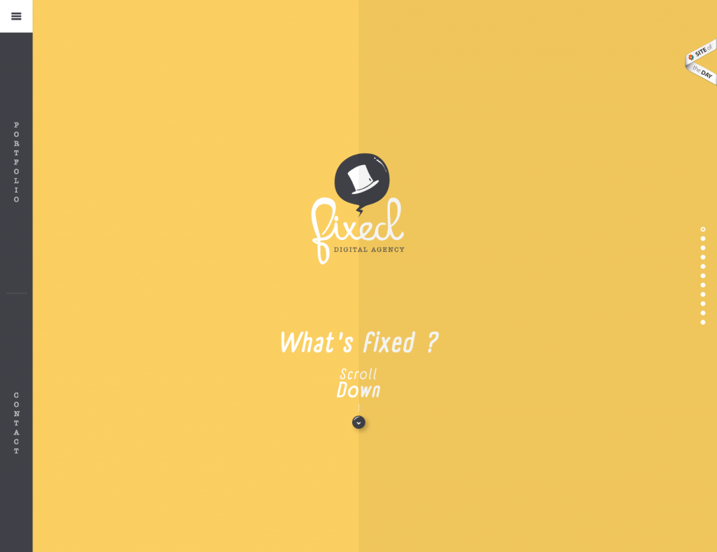
Parallax can be a great introduction to any business, FixedAgency really show off their skills with this fancy little number. I particularly like the audio clicks from the menu, usually I agree with the “seen and not heard” rule for websites, but this just feels responsive and classy.



Wow those are fabulous websites even if Parallax sounds like it’s sci-fi.
Ya… I understand a Parallax website design is now a days a very best single page website design that looks really very stunning just because of its 3D effects and scrolling.
I really like the all 7 latest Parallax website design the most. If I will go to make a new website then I will surely choose one out of them for my website layout.
Thanks to share these wonderful designs.
Love a bit of parallax scrolling!
Apple New Mac Pro – thats some brilliant printing quality right there. It just jumps off the page!
Comments are closed.